


Data Visualization
Types and Meanings of Histograms Used in Data Analysis
The data we encounter frequently in daily life and business life provide us with important clues. One of the most effective ways to understand the characteristics and distributions of these data is to use a histogram graph. Histogram is a statistical method that allows us to visualize the distribution of data by summarizing the data. Depending on the type of histogram plot, we can interpret symmetry, skewness and outliers in the data. For detailed information about histograms, you can review my article titled What is Histogram?
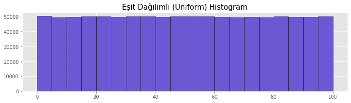
Uniform Histogram
In a uniformly distributed histogram, the number of data in the groups is expected to be equal. Due to experimentation and randomness, small differences between groups can be ignored to a certain extent. Dice and coin toss data are examples for a uniform histogram.
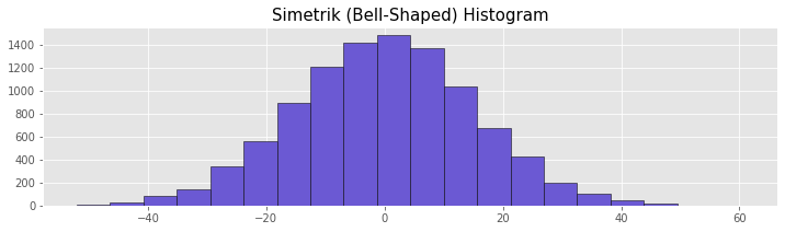
Bell-shaped Histogram
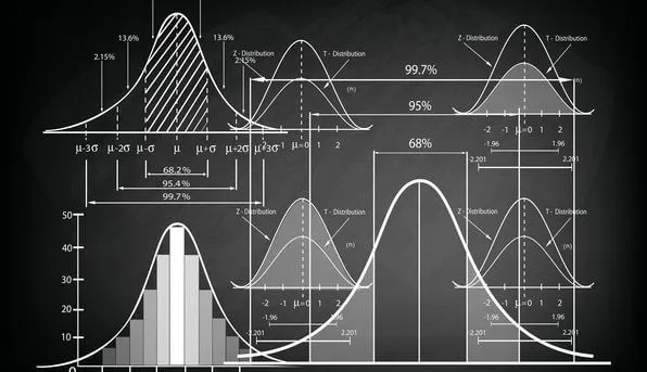
In a symmetric histogram, the data is symmetrically distributed to the left and right of the midpoint. In a symmetric histogram, the distribution of the data resembles a bell curve. This type of data largely follows a normal distribution. This distribution is particularly common in naturalistic data around a certain mean, such as height. Variance can be interpreted based on the horizontal length of the histogram. As the width of the histogram increases, the variance increases. This indicates that there is more variation in the data.
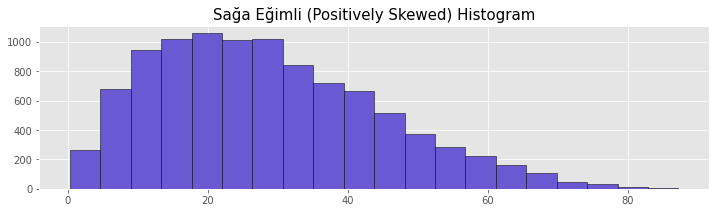
Positively Skewed Histogram
Right-skewed histograms have the peak on the left side of the center line of the graph. The distribution has a long right tail. This distribution is also known as a right skewed distribution. In right skewed distributions, the order Mean > Median > Mode occurs.
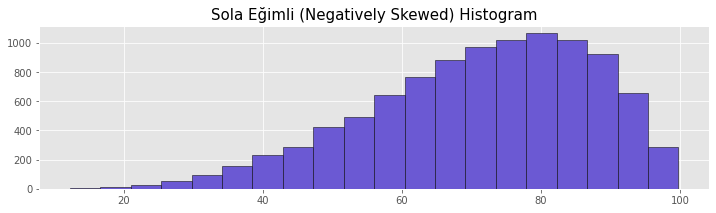
Negatively Skewed Histogram
In left-skewed histograms, the peak is located on the right side of the center line of the graph. The distribution has a long left tail. This distribution is also known as a left-skewed distribution. In left skewed distributions, the order Mode > Median > Mean occurs.
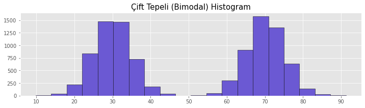
Bimodal Histogram
Bimodal histograms have two peaks. This distribution indicates that there are two groups in the dataset that differ from each other. Using this distribution, the characteristics of the groups in the data can be analyzed and interpreted. Inferences from the Bimodal histogram can shed light on clustering studies and strategic decisions.
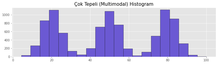
Multimodal Histogram
This type of histogram is similar to a multimodal histogram. In a multimodal histogram, there can be many peaks. This indicates that there are different groups in the dataset. This distribution is often found in inhomogeneous datasets. Multimodal histograms have an important place in examining and analyzing the characteristics of different groups in the dataset.
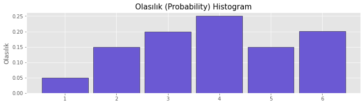
Probability Histogram
The probability histogram shows the probability of the data in the groups. Therefore, the sum of all group values is equal to 1 in this histogram.
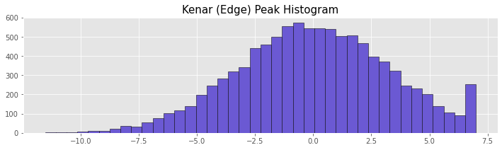
Edge Peak Histogram
In this type of histogram, there is more data in the beginning or end group of the graph. In this distribution type, especially edge groups should be examined. The Edge Peak histogram may indicate that the lower or upper boundary is incorrectly determined.
If you want to be informed about new works and similar content, you can follw me on the accounts below.
Linkedin: www.linkedin.com/in/mustafabayhan/
Medium: medium.com/@bayhanmustafa
About author

Mustafa Bayhan
Hi, I'm Mustafa Bayhan. I am an Industrial engineer who works in data-related fields such as data analysis, data visualization, reporting and financial analysis. I am working on the analysis and management of data. My dominance over data allows me to develop projects in different sectors. I like to constantly improve myself and share what I have learned. It always makes me happy to meet new ideas and put these ideas into practice. You can visit my about me page for detailed information about me.
You may also like

2 Comments
Leave a Reply
Recent Posts

Kumru AI İncelemesi: Güçlü Yönleri, Zayıf Yönleri ve Kullanım Deneyimi

Large Language Models (LLMs): RAG, Context Engineering, and AI Agents

Model Selection in Data Analysis: What are AIC and BIC?
Types and Meanings of Histograms Used in Data Analysis

Can Correlation Be Used to Infer Causality?

Histogram Nedir, Histogram Grafiği Nasıl Yapılır?


Nick July 4, 2026, 5:38 a.m.
References: Merkur lucky pharaoh online Punta Cana Resort All Inclusive
Cooper June 16, 2026, 4:42 p.m.
References: Neueste online casinos deutschland lindau-casino.online-spielhallen.de